
Mise en avant
Accès rapides
En action

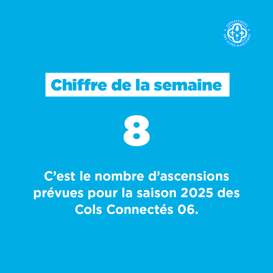
Chiffre de la semaine

');--global-select-caret-offset: 32px;--global-select-caret-offset-mobile: 20px;--global-select-padding-right: em(5.5, strip-unit(1.8rem));--global-choices-multiple-padding-bottom: 0.45em;--global-choices-padding-mobile: 0.55em 1.15em;--global-choices-multiple-item-offset: 0.25em;--global-form-dropdown-shadow: 0 3px 5px rgba(0, 0, 0, 0.6);--global-rch-fz: 1.8rem;--global-rch-ff: var(--global-input-ff);--global-rch-fw: var(--fw-normal);--global-rch-fs: normal;--global-rch-color: #000;--global-rch-left-offset: 33px;--global-rch-pseudo-box-size: 24px;--global-rch-pseudo-box-bg: #fff;--global-rch-pseudo-box-border: #5a5a5a;--global-rch-pseudo-checkmark-width: 2px;--global-rch-pseudo-checkmark-color: #e7e7e7;--global-rch-pseudo-checkmark-color-active: var(--color-1--1);--global-rch-pseudo-checkmark-color-grayscale: #575757;--global-rch-legend-ff: var(--typo-1);--global-rch-legend-fz: 1.8rem;--global-rch-legend-fw: var(--fw-bold);--global-rch-legend-fs: normal;--global-rch-legend-color: #727272;--scrollbar-width: 17px;--scroll-padding: 30% 0}.site-content__wrapper::after,.container::after{clear:both;content:"";display:block;height:0;overflow:hidden;visibility:hidden}.section__more-links{align-items:center;display:flex;flex-wrap:wrap;margin:0 -5px}.section__more-links>button,.section__more-links>a,.section__more-links>.btn{margin:5px}.is-center.section__more-links{justify-content:center}.is-left.section__more-links{justify-content:flex-start}.is-right.section__more-links{justify-content:flex-end}.site-content__wrapper,.container{box-sizing:border-box;margin:0 auto;max-width:1280px;padding:0 40px;width:100%}@media screen and (max-width: 1024px){.site-content__wrapper,.container{padding:0 60px}}@media screen and (max-width: 767px){.site-content__wrapper,.container{padding:0 20px}}.is-one-page .site-content__wrapper,.is-one-page .container{padding:0 !important}@media screen and (max-width: 1024px){.is-one-page .site-content__wrapper,.is-one-page .container{padding:0 40px !important}}@media screen and (max-width: 767px){.is-one-page .site-content__wrapper,.is-one-page .container{padding:0 18px}}.container.is-lg{max-width:1260px}.container.is-sm{max-width:980px}.container.is-fluid{max-width:1920px;padding:0}html{font-size:62.5%;scroll-padding:30% 0;scroll-padding:var(--scroll-padding)}body{background:#fff;color:#000;font-family:"Montserrat", Arial, Tahoma, sans-serif;font-family:var(--typo-1);font-size:1.8rem;margin:0;overflow-x:hidden}body.is-overflow-hidden{overflow:hidden}body.is-transparent{background:rgba(0,0,0,0)}body.is-center-content{align-items:center;display:flex;justify-content:center}.webchat__btn{margin-bottom:59px}a:focus,button:focus,input:focus,select:focus,textarea:focus{outline:2px solid currentColor;outline-offset:-3px}a{color:inherit}button{margin:0}b,strong{font-weight:700;font-weight:var(--fw-bold)}.print-banner,.print-footer{display:none}span[class*=fa-]{pointer-events:none}img{display:block;height:auto;max-width:100%}.lazy{background-image:image("placeholder-image.svg") !important}.lazy{transition:opacity 250ms ease-in-out 0ms;background-color:#e7e7e7;background-position:center center;background-repeat:no-repeat;background-size:50% 50%}@media screen and (-ms-high-contrast: active), (-ms-high-contrast: none){.lazy{animation:none;background-size:50%}}.lazy.lazyloading{animation:loadingPlaceholder 2s infinite}@media screen and (-ms-high-contrast: active), (-ms-high-contrast: none){.lazy.lazyloading{animation:none;background-size:50%}}.lazy.lazyloaded:not(.is-no-image){background-image:none !important}.lazy.lazyloaded:not(.is-no-image){animation:fadeIn 300ms linear forwards}.lazy.not-loaded{background-image:image("placeholder-image-not-loaded.svg") !important}.ytp-cued-thumbnail-overlay-image{background-position:center !important;background-size:contain !important}.ytp-cued-thumbnail-overlay-image{background-repeat:no-repeat;height:100%;position:absolute;width:100%}.section{margin:70px 0}@media screen and (max-width: 1024px){.section{margin:50px 0}}.home-page .section,.home-hospital-page .section{margin:150px 0}@media screen and (max-width: 1024px){.home-page .section,.home-hospital-page .section{margin:100px 0}}@media screen and (max-width: 767px){.home-page .section,.home-hospital-page .section{margin:80px 0}}@media screen and (max-width: 767px){.home-page .section .section__title,.home-hospital-page .section .section__title{flex-direction:column}}@media screen and (min-width: 1025px){.single-job .section{margin-bottom:30px}}@media screen and (min-width: 1025px){.section.is-width-33 .section__title{margin-bottom:15px}}.section.is-inverted{background-color:#000}.section.is-middle{margin-left:auto;margin-right:auto;max-width:996px}.section__title{align-items:center;display:flex;margin-bottom:30px}.section__title>*:not(:last-child){margin-right:10px}.section__title .title:only-child{margin-right:0}.section__title .title+.tag-links{margin-top:37px}@media screen and (min-width: 768px)and (max-width: 1024px){.section__title .title+.tag-links{margin-left:20px;margin-right:-36px}}@media screen and (max-width: 767px){.section__title .title+.tag-links{margin:28px 0 0}}@media screen and (max-width: 767px){.section__title .btn{margin-top:5px}}.section__more-links{justify-content:center;margin-top:5px}.section.widget-iframe{margin:80px 0}.section.widget-iframe .rte.title{margin-bottom:35px}.site-wrapper{display:flex;min-height:100vh;overflow-x:hidden;width:100%}.site-wrapper__inner{display:flex;flex-direction:column;flex-grow:1;min-height:100vh;width:100%}.site-wrapper__header{position:relative}.site-wrapper__header,.site-wrapper__footer{flex-basis:auto;flex-grow:0;width:100%}.site-wrapper__footer{position:relative}.site-wrapper__main{flex-grow:1;min-height:1px;position:relative;width:100%}.site-wrapper.is-overflow-hidden{overflow:hidden}.site-content__wrapper{display:flex;flex-wrap:wrap;padding-bottom:120px;padding-top:40px;position:relative;z-index:0}@media screen and (max-width: 1024px){.site-content__wrapper{padding:40px 60px 120px}}@media screen and (max-width: 767px){.site-content__wrapper{padding:30px 18px 120px}}.site-content__wrapper .is-404{padding-top:28px}@media screen and (max-width: 1024px){.site-content__wrapper .is-404{padding-top:21px}}@media screen and (max-width: 767px){.site-content__wrapper .is-404{padding-top:10px}}.is-job .site-content__wrapper{padding:0 40px}.site-content__main{flex-grow:1;width:1%}.site-content__main>*:first-child{margin-top:0}.site-content__sidebar{padding:0 0 0 126px;width:408px}@media screen and (max-width: 1024px){.site-content__sidebar{padding:0;width:100%}}.site-content__sidebar.is-left{order:-2;padding:0 120px 0 0}@media screen and (max-width: 1024px){.site-content__sidebar.is-left{padding:0}}.site-content__sidebar.is-facets{margin-left:-30px;order:-2;padding:0 90px 0 0}@media screen and (max-width: 1024px){.site-content__sidebar.is-facets{margin:0;padding:0;width:0}}.is-one-page .flex-row>.section{padding:0 12px;width:100%}@media screen and (max-width: 1024px){.is-one-page .flex-row>.section{padding:0 40px !important}}@media screen and (max-width: 767px){.is-one-page .flex-row>.section{padding:0 12px}}.is-one-page .rte:not(.infowidget>.rte):not(.title){max-width:1280px;padding:0}.is-one-page .table-content .rte{padding:0 !important}.is-one-page .table-content .rte .table-responsive{max-width:100%}.single-album .site-content__wrapper{max-width:100% !important;padding:0 !important}.single-album .gallery.carousel{max-width:100%;padding:0}.single-album .rte:not(.infowidget>.single-album .rte):not(.title){max-width:1280px !important;padding:0 40px !important}.single-album .rte:not(.infowidget>.single-album .rte):not(.title){margin:0 auto}@media screen and (max-width: 1024px){.single-album .rte:not(.infowidget>.single-album .rte):not(.title){padding:5px 62px 40px}}@media screen and (max-width: 767px){.single-album .rte:not(.infowidget>.single-album .rte):not(.title){padding:10px 20px 40px}}.single-album .pager__listitems{margin:30px auto 80px !important;max-width:1280px !important;padding:0 40px !important}@media screen and (max-width: 1024px){.single-album .pager__listitems{padding:5px 62px 40px !important}}@media screen and (max-width: 767px){.single-album .pager__listitems{padding:10px 20px 40px !important}}